
What makes a good logo design?
All the biggest companies in the world have logos that can be recognised by almost anyone.
These logo designs were strategically crafted in such an intricate way, as logos need to communicate a clear message to their audience.
Discover what fundamental elements needed to make a logo design.
The 3 components that make a good logo design are:
Simplicity - Keeping a logo simple allows it to be memorable and more effective. The audience needs to recognise the logo mark despite it’s location.
Appropriation - Capturing a key element of a brand and allowing it to communicate visually. The use of semiotics is effective and relevant with logo design.
Individuality - Every business has a unique element. Bringing this unique quality to a visual representation can be effective for a logo design, allowing it to stand out.
Simple
Being simple isn’t easy.
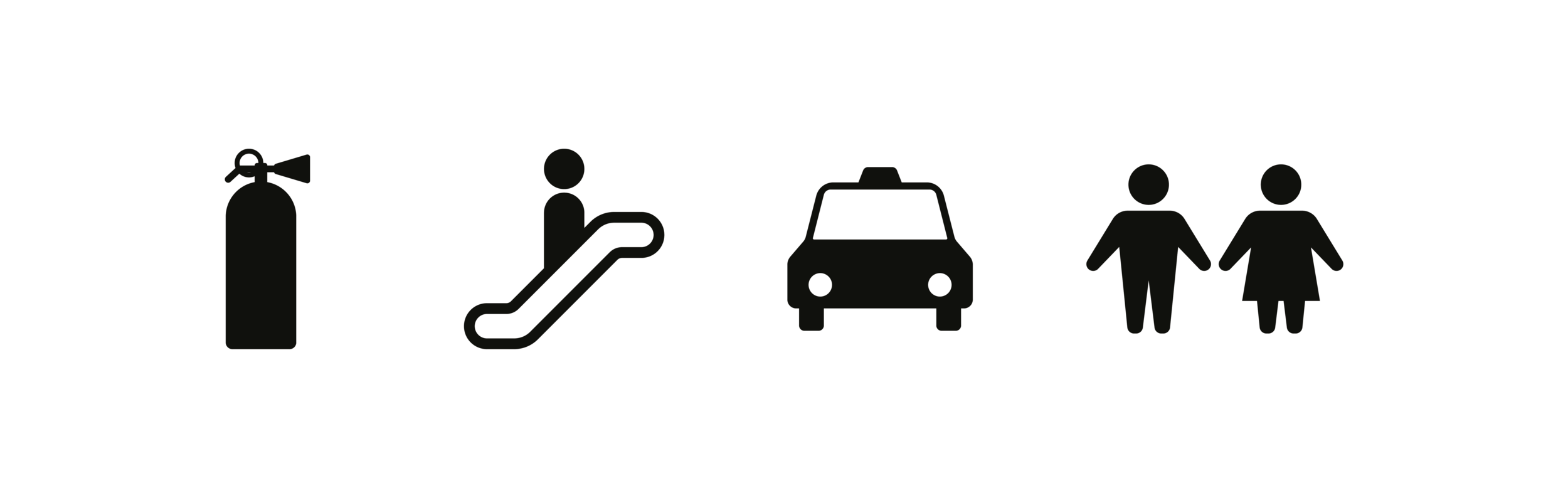
As humans, we tend to add rather than take away. An effective message is always clear and straight forward for the target audience to understand. The same way we communicate daily to one another, is the same way symbols such as fire, stairs, taxis and toilet signs, direct and inform us.
Without a doubt, these symbols are learnt over time, but also very easy to learn due to the simple use of geometric shapes (circles, square, triangles, etc).
The same principles are applied to good logo designs as they too are also symbols that inform and communicate a message.
Additionally, professional logo designers aren’t hired to make a logo ‘pretty’, but in fact they are experts at making it simple.
Keeping a logo design simple also means very few ideas are involved. A common solution that bad logo designs involve are when components are added together to make one logo mark. For example:
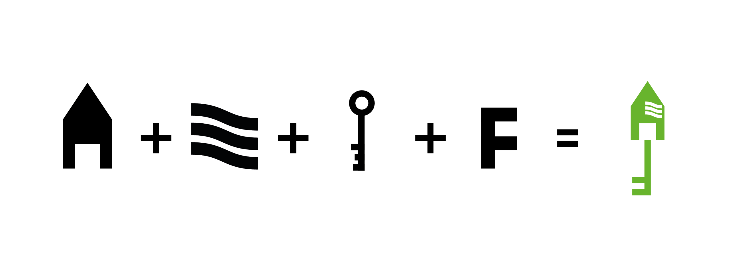
Even tho it remains simple due to the use of geometric shapes, it is a prime example of a bad logo design.
There is a high chance that such a logo design may need to be redesigned in the near future.
Appropriate

When a logo design is seen, it doesn’t have to tell a whole story, but rather the end of story.
This means for example, a logo design for a fast food chicken restaurant, doesn’t have to capture: ‘chicken being prepared by the chef, and then seasoned which is then finely placed in a premium takeaway box’.
But instead can simplify the process, an element which aligns with a companies core value such as focusing on the quality of their chicken (in this scenario) and developing that idea as a simple and unique icon. The nike logo design is a simple swoosh/ tick.
We are all aware that Nike focuses on sports wear. The tick actually represents movement and pace, which is a simplified, appropriate idea.
Semiotics plays apart in ‘appropriate’ logo design. Finding a relevant component to the business, allows the audience to subconsciously associate a logo design with what the business offers. This increases a logos memorability over time.
Unique
The same way toilet symbols are simple and recognisable, is the same way logo designs also need to be.
As mentioned, these symbols are very simple which make them recognisable, however, they do indeed lack uniqueness amongst each other.
The toilet symbols are likely to be identical in shopping mall A, B and C. A logo design needs to be completely distinguishable regardless on its environment. This is where careful thought and creativity comes in to play.
Expert logo designers are able achieve this effectively, as they are able to simplify and develop ideas that hold value for the company that hires them.
Overall, there is no debating that a good logo needs to be simple, appropriate and unique, as all the successful brands today, have this in-common.
Not to say that a business can only be successful with these elements in their logo, but off course there are sometimes cases where successful companies have bad logos that don’t follow the criteria above.
However, these companies often tend to carry out a ‘re-branding’ as they have reached a certain level.