
The real reason you need to balance simplicity & uniqueness…
What makes a logo instantly recognizable while others are forgotten?
Why do some brands dominate the market while others struggle for attention?
The answer lies in a delicate balance between simplicity and uniqueness—a design principle I call The Simplicity-Adoption Tradeoff (SAT).
Too complex? People won’t process or remember it. Too simple? It blends in and loses identity.
The best logos sit in the sweet spot—simple enough to be adopted, unique enough to stand out.
How I Discovered the Simplicity-Adoption Tradeoff
Throughout my career as a logo designer, I noticed a pattern across successful brands.
Logos that were too complex struggled with adoption.
Logos that were too simple lacked differentiation.
Logos that balanced simplicity and uniqueness thrived.
This led to the development of The Simplicity-Adoption Tradeoff—an approach that explains how a logo’s level of simplicity directly impacts its likelihood of adoption.
The Simplicity-Adoption Tradeoff states:
“The simpler a design is, the more likely it is to be adopted and accepted by people. However, if a design becomes too simple, it loses uniqueness and fails to stand out.”
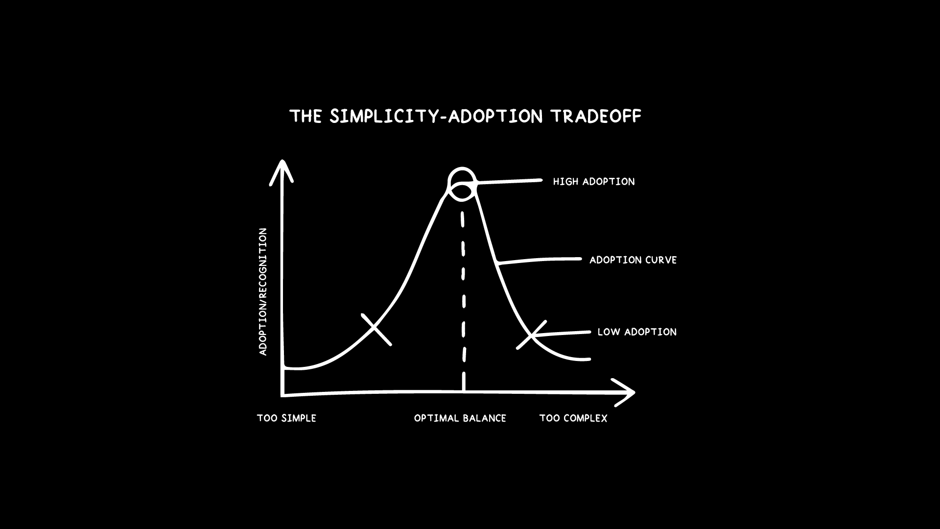
The Simplicity-Adoption Tradeoff
X-Axis: Simplicity (Too Simple → Too Complex)
Y-Axis: Adoption/Recognition (Low → High)
A logo that is too simple lacks character and becomes generic, making it forgettable.
A logo that is too complex is harder to process and less likely to be widely adopted.
The ideal logo lives in the middle of the curve—the sweet spot where it is simple enough to be adopted but unique enough to stand out.
The Science Behind SAT: Why This Tradeoff Works
This tradeoff isn’t just opinion—it’s backed by cognitive science and design psychology.
Mere-Exposure Effect (Familiarity Bias) – People prefer things they recognize or are familiar with. Simpler designs are easier to adopt.
Von Restorff Effect (Isolation Effect) – Visually distinct elements are more memorable. Overly simple logos can become too generic.
Hick’s Law (Decision Fatigue) – The more choices a person has, the longer it takes to process information. Overly complex logos overwhelm the brain, making them harder to recognize and adopt.
These principles prove that the best logos sit in the SAT “sweet spot”—simple yet uniquely recognizable.
Logos That Follow SAT: Real-World Examples

Some of the world’s most recognizable logos are perfect examples of SAT in action.
Nike Swoosh – Incredibly simple, yet its motion-inspired curve makes it unique.
Apple Logo – A minimalist apple shape, but the bite prevents it from being generic.
McDonald’s Golden Arches – Just an “M,” but the shape and color combination make it instantly recognizable.
However, many logos have suffered from oversimplification.

Mastercard’s 2019 Logo Update – Removed too much detail, making it blend in with other generic circular designs.
Modern Minimal Rebrands – Many brands strip away too much, losing distinctiveness in the pursuit of simplicity.
SAT explains why these successful logos work—they balance simplicity for quick adoption with unique elements for memorability.
How to Apply The Simplicity-Adoption Tradeoff in Logo Design
Here’s how you can use SAT as a design tool:
Start complex, then refine – Strip unnecessary details while ensuring the logo retains its identity.
Test for instant recognition – Show your logo to someone for three seconds and ask if they can recall it.
Use the SAT Graph as a guide – Find the balance between simplicity and uniqueness.
“The best logos are not just simple—they are strategically simple. The Simplicity-Adoption Tradeoff is a tool for designers to create more effective logos that balance simplicity and uniqueness.”
