
How to Chose The Right Type of Logo: Pictorial, Monogram or Wordmark.
Choosing what type of logo to create can be one of the hardest decisions in a logo and identity design project.
There are three core logo types established by Michael Schumate in his book Logo Design Theory—Pictorial*, Wordmark, and Monogram.
And while there are sub-categories within each (like mascots under pictorial or letter-marks under monograms), every logo sits within one of these three identity components.
But which one should you choose for a client’s brand?
This blog introduces a smarter way to choose the best type of logo by using a strategic decision-making framework I call The Logo Fit Model.
It helps you quickly assess which logo form is most appropriate for the brand’s industry, communication style, and long-term identity goals.
Here is a smarter and faster way to choose the best type of logo to create for a brand.
Key Takeaways
Most logos fall into one of three categories: pictorial, monogram, or wordmark
Choosing the wrong logo type can lead to misaligned branding
The Logo Fit Model helps identify which logo type best suits a brand based on its goals and industry
It helps streamline your ideation process and avoid unnecessary exploration
The goal is not just creativity—but creative precision
The Problem
Too often, designers jump straight into concepts without considering what kind of logo actually suits the business.
This leads to logos that look good—but don’t work well.
For example, I mentioned this in A Smarter Way to Generate Logo Ideas—imagine if Apple used a wordmark…
It wouldn’t suit the compact, sleek nature of their product ecosystem. It also wouldn’t function well across small devices like iPhones and watches.
This is clearly not a good solution for such a brand considering the market it operates in.
So why even explore a wordmark direction for companies where that would never make sense?
There’s a better way to make this decision early—saving time, reducing unnecessary stress, revisions, and producing more intentional work.
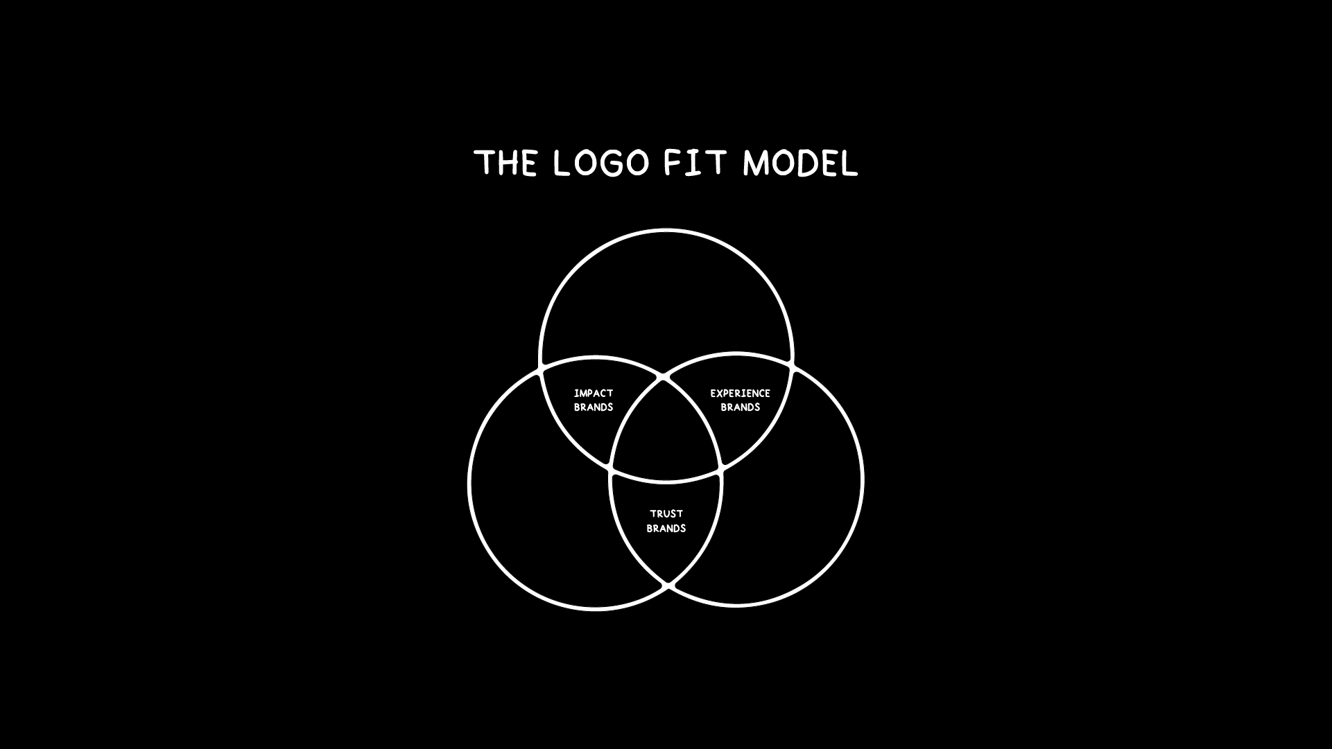
The Solution: The Logo Fit Model
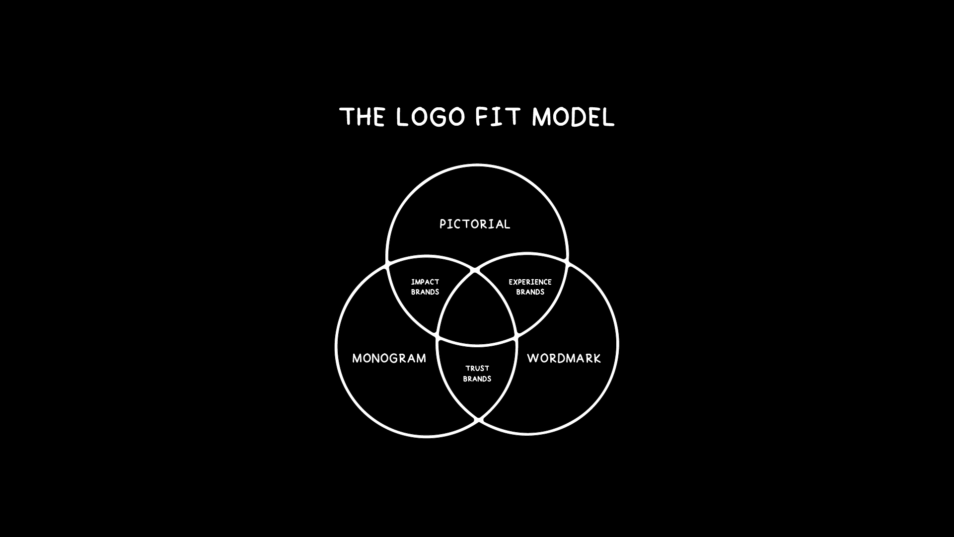
The Logo Fit Model
With nearly a decade of experience in logo design, and encountering thousands of logos across various industries, I noticed a clear pattern:
Most brands can be categorized into one of three brand types—and each aligns best with two of the three logo types.
The Logo Fit Model - Full
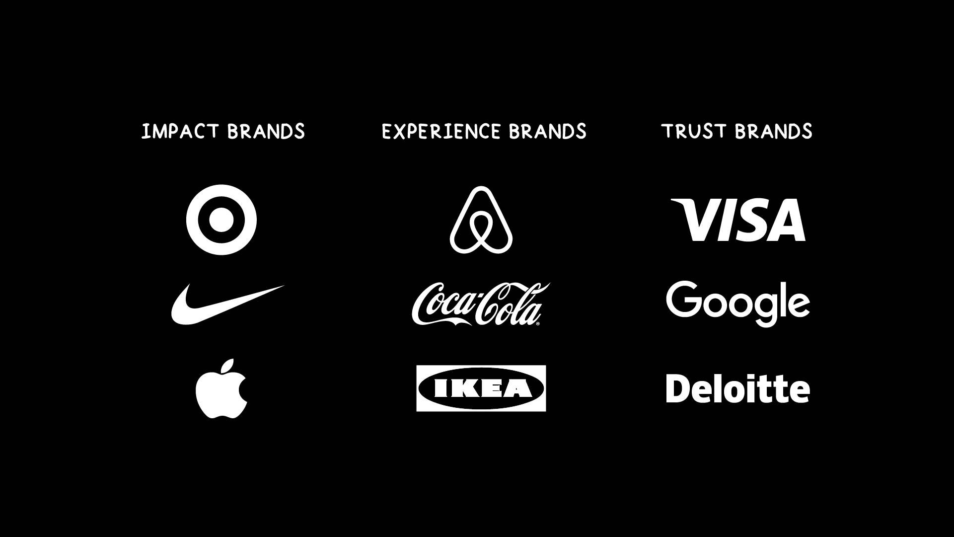
1. Impact Brands
These brands disrupt, innovate, or express bold ideas. They thrive on memorability and differentiation.
Best suited for: Pictorial logos / Monograms
Think: Nike, Apple, Target
2. Experience Brands
These brands rely on emotion, style and personality of the product or service. Often expressive or fashion-forward.
Best suited for: Pictorial logos / Wordmarks
Think: Airbnb, IKEA, Coca-Cola
3. Trust Brands
These brands prioritize professionalism, clarity, and long-term credibility.
Best suited for: Wordmarks / Monograms
Think: IBM, Google, Deloitte
This isn’t a strict rule—but it’s a reliable guide.
Some brands have succeeded outside their typical category—but for most, the Logo Fit Model helps you filter the right option early, reducing wasted time and refining the creative direction with purpose.
So how do you use this model?
Different types of brands
First, identify what type of brand you’re working with—Impact, Experience, or Trust.
Then, use the Logo Fit Model to determine which two logo types are best suited for that category.
From there, you’ll be able to filter your ideas and focus your creative energy on the identity components that make the most sense.
In upcoming blogs, I’ll show how to connect this framework to your Identity Brainstorm Method, so you’re not only generating ideas—but strategically applying them to the right kind of logo: pictorial, monogram, or wordmark.
Conclusion
The Logo Fit Model gives you clarity, direction, and creative focus.
Instead of wasting time exploring every possible logo direction, you can confidently narrow your focus—and invest your energy where it counts.
This is how you design smarter—not just more.
Because efficiency isn’t about cutting corners—it’s about cutting the right ones.
What type of logo do you naturally gravitate toward when designing—and why?