
PS5/ Playstation logo history
If you are like me, you are probably still searching the web for the next PS5 release date in hopes to purchase it.
To keep you occupied, i’ve decided to share the history of the Playstation logo design.
When the PS5 was first announced, the logo design that was presented was… the same.
Many people had problems with this but I believe it was the best move to take. Over the years, Playstation has taken a simple approach to their logo designs.
Discover and learn the history of Playstation logo designs.
Quick Note
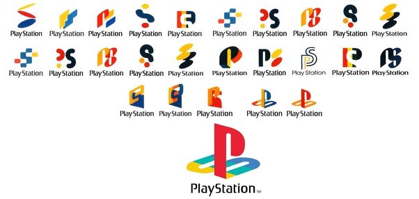
If you see these logo designs over the internet, just bare in mind these were never actually used. These are the initial drafts for Playstation logo design.
Despite ther’re being a large variety of vibrant logos, the silhouette between each logo had a particular aesthetic; fun, playful and excitement.
The logo they went for in the end was obviously the one we all see today which is the letters ’p’ and ‘s’, intertwined and overlapping.
Playstation - The first logo design

1994
In 1994, Playstation revealed their first console at an E3 event also revealing the first Playstation logo design.
The logo design is relatively geometric with a combination of two letters ‘p’ and ‘s’.
This type of logo design is a monogram, it can also be considered as a timeless logo design as only two different types of shapes are used; squares and circles.
Playstation 2 - Retro Vibe

Playstation Logo design 2000
The playstation 2 console was the first revolution with the Playstation consoles. This was the first console by Sony that started using discs instead of cartridges.
Such an evolution needed a change in the logo design for a symbolic reference to the future. playstation next logo consisted of an extremely minimal design which used extremely thin shapes that spell out ‘PS2’.
This approach really gave a futuristic vibe, similar to SI-FI movies that were set in the near future.
This design choice was very minimal, yet still had personality. The logo design was also accompanied by a blue sky gradient, referencing the colour of the new game discs for their consoles.
Playstation 3 - The New Era

Playstation 3 Logo design 2006
It is safe too safe that this generation of gaming was an evolution. With HD televisions becoming the norm within house holds, gaming in that quality was only right.
Playstation 3 was Sony’s first HD console as due to the HMDI import. This era came with a new logo design for the console, which is more stylish, premium and modern.
Swerving away from the previous ‘mono-line’ logo design, Playstation 3 logo was by far, more contemporary than the previous. With a combination of different weights, typeface was very original and none like it.
Despite the change in the typeface, the ‘PS’ monogram logo mark stayed the same. Sony started using the original Playstation logo design separately when promoting its consoles. The original logo brings a sense of nostalgia for original gaming, as well as its timeless form.
Playstation 4 - Time Proof

Playstation 4 Logo design 2013
After 7 years, the Playstation 4 was announced and released.
With a few differences to their consoles such as storage, speed and build. The PS4 had a completely different build compared to its predecessor. With a more rectangular approach, the PS4 was very popular compared to its rival - Microsofts’ XboxOne.
Regardless on several changes, the PS4 logo design was identical to the previous PS3 logo design, but with only the number change.
Im sure many people wasn’t surprised when this was done, even tho the consoles were seven years appart.
The logo design still worked as it was very minimal and had its own personality. For the logo design to work 7 years later, with an additional 5-7 years of its life span before the new console, this was proof of a timeless logo design.
Playstation 5 - Where we are today
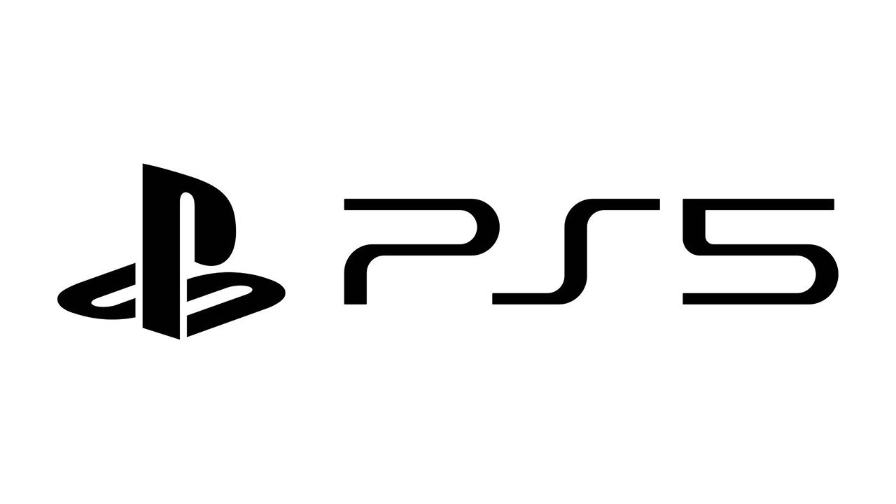
Playstation 5 Logo design 2020
The ps5 was first revealed in 2020, with an amazing online event showcasing its new feautres.
However, many were shocked and rattled as to why the PS5 logo hadn’t changed for 13 years now.
People were quick to express them selves on social media platforms, creating memes suggesting how Sony came up with their ‘new’ PS5 logo design.
This is a common reaction from the public as logo design now days is easy to be criticised as anyone can express/ share their opinion virtually.
Despite these criticism, this hasn’t stoped the extremely high demands for the console. The logo design has been going 13 years strong, and Sony are still progressing
It is clear that the logos haven’t changed drastically. Despite the small changes, the logo design still held the same characteristics through out the years.
A unique, vibrant and confident image was portrayed through the logo design over the years.
Many individuals feel that sony are being lazy with their logo, but instead their being wise. Keeping the same logo over the years brings the same nostalgic and exciting moments when gaming, but yet, a different experience each generation.
The PS logo designs over the years, is a unique and timeless vessel to carry the value of Playstation gaming.